
True image performance is not about universal compression settings; it’s about building an intelligent pipeline from archival to delivery that prioritizes the user’s perceived experience.
- Modern formats like AVIF offer superior compression but come with an encoding time cost, making format choice a strategic trade-off.
- Effective lazy loading requires more than a simple attribute; it demands the IntersectionObserver API to create a seamless, non-disruptive user flow.
Recommendation: Shift focus from raw file size to perceptual speed by implementing low-quality image placeholders (LQIP) and testing your site under throttled network conditions to develop true performance empathy.
For any web designer or developer, the conflict is constant: showcasing stunning, high-resolution photography versus the unforgiving demands of page load speed. You’ve meticulously crafted a visually rich experience, only to see it undermined by slow-loading images that cause users to abandon the site before the content even renders. The stakes are incredibly high, especially for portfolios, e-commerce sites, and brand showcases where visual impact is paramount.
The common advice is a familiar refrain: “compress your images,” “use a CDN,” “enable lazy loading.” While not incorrect, this surface-level guidance ignores the complex engineering trade-offs that separate a truly fast website from one that merely follows a checklist. The generic approach often leads to new problems, such as blurry images from double compression or jarring layout shifts from poorly implemented lazy loading.
But what if the key wasn’t just following rules, but understanding the cost of every decision? This guide takes a different approach. We will move beyond the basics to dissect the technical mechanisms behind elite image performance. We’ll analyze the trade-offs between formats like WebP and AVIF, architect a precise lazy loading strategy, and diagnose the silent errors that degrade quality. It’s time to stop making sacrifices and start making informed engineering decisions.
This article provides a structured path to mastering web image performance. Each section tackles a critical component, from choosing the right format to implementing a robust archival strategy, giving you the technical depth to deliver both speed and quality.
Table of Contents: High-Resolution Images on the Web: A Performance Engineer’s Guide to Speed Without Sacrifice
- WebP or AVIF: Which format delivers the best compression for photographic portfolios?
- How to code lazy loading so images appear exactly when the user scrolls?
- Why does a 3-second delay in image loading cost you 40% of your visitors?
- The saving mistake that makes your sharp photos look blurry on the live site
- How to set up a server-side script to generate responsive thumbnails automatically?
- The “bit rot” phenomenon that silently corrupts your JPEGs after 5 years
- How to design a master visual that adapts to Multiple Aspect Ratios
- Developing ‘User Empathy’: The Key to Diagnosing Image Performance Issues
WebP or AVIF: Which format delivers the best compression for photographic portfolios?
The debate between next-generation image formats is not about a single winner, but about making a strategic trade-off between file size, quality, and workflow compatibility. For photographic portfolios where visual fidelity is non-negotiable, the choice between WebP and AVIF is critical. While both significantly outperform JPEG, they serve different ends of the performance spectrum. AVIF generally produces files that are 20-30% smaller than WebP at an equivalent visual quality, making it a compelling option for reducing bandwidth.
However, this compression efficiency comes at a cost: encoding time. Generating AVIF files can be 3-5 times slower than WebP, a factor that can impact dynamic image generation pipelines or rapid content updates. A comprehensive study on photographic content highlighted this trade-off, finding that AVIF achieved a median file size reduction of 50.3% compared to JPEG, while WebP managed 31.5%. For developers, this means AVIF is the superior choice for final, static portfolio assets, whereas WebP remains a pragmatic option for sites requiring faster on-the-fly image processing.
The decision matrix below breaks down the key engineering considerations. AVIF’s support for 10-12 bit color depth and HDR makes it technically superior for capturing the subtle gradients and dynamic range essential in professional photography. WebP, with its near-universal browser support, offers a safer, more compatible default. A hybrid approach using the <picture> element, serving AVIF with a WebP fallback, is often the optimal solution.
| Criteria | WebP | AVIF | Best For |
|---|---|---|---|
| File Size Reduction | 26-30% smaller than JPEG | 50% smaller than JPEG | AVIF wins |
| Encoding Speed | Fast | Slower (3-5x) | WebP wins |
| Color Depth | 8-bit | 10-12 bit + HDR | AVIF for photography |
| Browser Support | 96%+ global | 85%+ (growing) | WebP for compatibility |
| Visual Quality | Good | Excellent | AVIF for portfolios |
| Workflow Integration | Wide support | Limited tools | WebP easier |
How to code lazy loading so images appear exactly when the user scrolls?
Native lazy loading (loading="lazy") is a useful baseline, but it lacks the precision required for a high-end user experience. To eliminate jarring content shifts and control exactly when images load, a frontend performance engineer must leverage the IntersectionObserver API. This browser API provides a robust way to trigger image loading not just when an element enters the viewport, but slightly *before*, creating a seamless and performant experience.
The core technique involves storing the high-resolution image URL in a data-src attribute. The src attribute, meanwhile, points to a tiny, blurred placeholder. This technique, known as LQIP (Low-Quality Image Placeholder), prevents layout reflow and gives the user immediate visual feedback. The IntersectionObserver is configured with a rootMargin (e.g., ‘300px 0px’) to create a loading buffer zone around the viewport. When the placeholder image enters this margin, the observer’s callback function swaps the data-src into the src attribute, initiating the load.
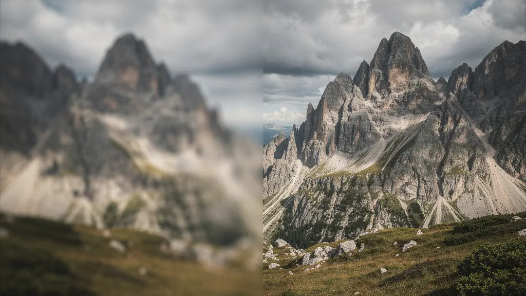
This “art-directed loading” approach transforms a potentially disruptive process into an elegant visual effect. As seen in the illustration, the transition from a blurred placeholder to a sharp image feels intentional and smooth. One portfolio that implemented this technique saw perceived loading time reduce by 60% based on user feedback, proving that *how* an image loads is as important as *how fast* it loads. After the high-resolution image is loaded, it is critical to call observer.unobserve(image) to prevent unnecessary processing and conserve system resources.
Implementing this requires a few key steps:
- Create an
IntersectionObserverinstance, providing a callback function and setting arootMarginto preload images before they become visible. - Select all images intended for lazy loading (e.g., those with a
data-srcattribute) and pass each one toobserver.observe(). - Inside the callback, check if
entry.isIntersectingis true. If so, move the URL fromdata-srctosrc. - To enhance the visual experience, apply a CSS class for a blur or fade-in animation during the transition.
- Once the image is loaded, call
observer.unobserve()on the element to free up resources.
Why does a 3-second delay in image loading cost you 40% of your visitors?
In web performance, time is not linear; it is exponential in its impact on user behavior. A one-second delay feels acceptable, but a three-second delay feels like an eternity, triggering frustration and abandonment. For image-heavy sites, the Largest Contentful Paint (LCP)—the time it takes for the main image or block of text to load—is the single most critical metric. If it exceeds 2.5 seconds, you are actively losing audience and revenue. The often-cited 40% figure is actually conservative; Google’s research shows that 53% of mobile visitors leave a page that takes longer than three seconds to load.

This abandonment is not just a statistic; it’s a direct reflection of a user’s emotional journey from anticipation to frustration. The initial engagement quickly sours into impatience, and the back button becomes an escape from a poor experience. This is not just a B2C problem; it has measurable business consequences in all sectors. A case study on Renault’s automotive site provided hard evidence of this connection. By improving their LCP by just one second, they achieved a 14% reduction in bounce rate and a 13% increase in lead completions. This demonstrates a direct, quantifiable link between image loading speed and business outcomes.
The cost of slow images is therefore threefold:
- Audience Loss: Over half your potential mobile audience may never see your content.
- SEO Penalty: Page speed is a core ranking factor. Slow LCP directly harms your site’s visibility in search results.
- Conversion Impact: For every second of delay, you lose a tangible percentage of leads, sales, or sign-ups.
The mandate for developers is clear: optimizing image delivery is not a “nice-to-have” but a fundamental business requirement. Every kilobyte saved and every millisecond shaved off the LCP translates directly into a better user experience and stronger business results.
The saving mistake that makes your sharp photos look blurry on the live site
One of the most frustrating issues for a developer is uploading a perfectly sharp image only to find a blurry, artifact-ridden version on the live website. This quality degradation is almost always caused by cumulative quality loss, also known as “double compression.” It occurs when an already-optimized image is re-compressed by a server, a CMS, or a plugin, with each step stripping away more data and introducing visual artifacts.
A common culprit is a CMS like WordPress, which by default applies its own compression level (historically around 82%) to all uploaded JPEGs. If you upload a JPEG already saved at 85% quality from Photoshop, the final image has been compressed twice, resulting in a much lower effective quality than intended. This silent mistake undermines all your careful optimization work. Another frequent error is using the wrong color profile. Images saved in ProPhoto RGB or Adobe RGB may look vibrant in editing software but will appear washed out and desaturated in most web browsers, which expect the sRGB profile.
Case Study: The Double Compression Trap
A photography portfolio website was plagued by blurry images despite uploading high-quality files. An investigation using browser developer tools revealed that WordPress was applying an 82% compression on top of their 85% exports from Photoshop. The solution was to add a filter to their theme’s `functions.php` file (`add_filter(‘jpeg_quality’, function() { return 100; });`) to disable the CMS’s default compression. This single change restored the intended image sharpness and, combined with proper `srcset` implementation, actually reduced overall file sizes by 15% by eliminating the redundant processing step.
To prevent these issues, a systematic audit of your entire image pipeline is essential. You must identify and neutralize every point where unintended compression or color profile conversion can occur. This requires treating your image workflow as a controlled environment, not a black box.
Action Plan: Diagnosing and Fixing Image Quality Loss
- Compression Audit: Systematically check for double compression. Disable CMS auto-compression (e.g., set WordPress quality to 100) and any image optimization plugins temporarily to isolate the source of quality loss.
- Source File Integrity: Verify that all web images are exported from a master file (like a TIFF or original RAW) using the sRGB color profile. Never use ProPhoto or Adobe RGB for web distribution.
- Dimension & `srcset` Validation: Inspect the rendered page in your browser. Ensure the `<img>` tag uses a `srcset` attribute that provides multiple, correctly sized image files for different viewport containers. Avoid forcing the browser to downsample large images.
- Optimal Export Baseline: Re-export a sample image from your master file using a controlled setting (e.g., JPEG quality 85). Compare its file size and visual quality against the live version to quantify the impact of your current pipeline.
- Correction and Implementation: Based on the audit, implement a permanent fix. This may involve adjusting CMS settings via code, regenerating all images with the correct profiles and `srcset` attributes, or replacing aggressive plugins with a more controlled server-side process.
How to set up a server-side script to generate responsive thumbnails automatically?
Relying on manual image resizing and optimization is inefficient and prone to error. A professional workflow demands an automated, server-side process that can generate multiple responsive versions of an image from a single high-resolution upload. This ensures consistency, saves significant time, and allows for a scalable content strategy. The two primary approaches are building a self-hosted script or leveraging a third-party Image CDN.
A self-hosted solution, often built with a Node.js library like Sharp, offers complete control and zero monthly subscription fees. You can set up a script to “watch” an uploads folder. When a new master image is added, the script automatically generates a predefined set of derivatives (e.g., 1200px, 800px, and 400px widths) in multiple formats (e.g., AVIF and WebP). This approach is powerful but requires initial development time and ongoing maintenance. The server’s processing power also becomes a bottleneck at high volumes.
An Image CDN (like Cloudinary, ImageKit, or Imgix) abstracts this complexity away. Instead of pre-generating all sizes, you upload one master image to the CDN. You then request different versions on-the-fly simply by changing URL parameters (e.g., `w_800,q_auto,f_auto` to request an 800px wide image with automatic quality and format selection). This offers immense flexibility, AI-powered features like smart cropping, and the performance benefits of a global content delivery network. The trade-off is a recurring monthly cost that scales with usage.
The decision between a self-hosted script and a CDN is a classic build-vs-buy dilemma, hinging on factors like project budget, development resources, and required features. For projects with fewer than 10,000 images and basic resizing needs, a self-hosted script can be cost-effective. For larger-scale applications or those needing advanced features and maximum performance, a CDN is almost always the superior engineering choice.
| Factor | Self-Hosted Script | Image CDN (Cloudinary/ImageKit) | Break-Even Point |
|---|---|---|---|
| Monthly Cost | $0 + server resources | $89-299/month | ~10,000 images/month |
| Setup Time | 8-16 hours coding | 30 minutes | Time-sensitive projects favor CDN |
| Processing Speed | Depends on server | Optimized infrastructure | CDN faster for on-demand |
| Features | Basic resizing | AI cropping, auto-format | CDN for advanced needs |
| Bandwidth | Your server load | Global CDN included | CDN wins at scale |
| Maintenance | Ongoing updates needed | Fully managed | CDN for peace of mind |
The “bit rot” phenomenon that silently corrupts your JPEGs after 5 years
While we focus heavily on optimizing derivatives for the web, the long-term integrity of the original master files is often overlooked. Bit rot, or silent data corruption, is a real phenomenon where stored data degrades over time due to minute failures in storage media. For a photographer or business whose assets are their livelihood, discovering that a five-year-old JPEG archive is partially corrupted can be catastrophic. JPEGs are particularly vulnerable because their compressed nature means a single flipped bit can cause visible artifacts or render a file unreadable.
The only defense against bit rot is a robust archival strategy built on two principles: using a stable master format and implementing regular integrity checks. Your true “master” file should never be a JPEG or a web-optimized format. Instead, you should export an uncompressed or losslessly compressed version, such as a 16-bit TIFF or a full-resolution PNG, directly from your original RAW file or source design. These formats contain far more data and are more resilient to minor corruption.
To actively monitor for corruption, you must generate cryptographic checksums (like MD5 or SHA-256) for every master file at the time of archival. These checksums are unique digital fingerprints. By storing them in a separate text file and re-running the checksum calculation annually, you can immediately detect if a file has been altered in any way, even by a single bit. This allows you to restore the corrupted file from a backup before the damage spreads.
If the optimized web copy is your only copy, you’ve essentially fast-forwarded bit rot. The web optimization process should always create disposable ‘derivatives’, never modify the originals.
– Digital Asset Management Best Practices, Web Performance Documentation
This “masters and derivatives” workflow is the cornerstone of professional digital asset management. Your web images should be treated as disposable copies generated from a pristine, verified master archive. This separation ensures that no matter what happens to your live site, your original, high-quality assets remain safe and intact for future use.
How to design a master visual that adapts to Multiple Aspect Ratios
In a responsive world, a single hero image must perform flawlessly across a dizzying array of aspect ratios, from wide 16:9 desktop banners to 1:1 square social media cards and vertical 9:16 mobile screens. Simply cropping an image centrally is a recipe for disaster, often cutting off key subjects or destroying the original composition. The solution lies in a combination of strategic composition during creation and technical implementation using the <picture> HTML element.
The design principle is to compose with a “safe zone.” During the photoshoot or design process, you must ensure the critical elements of the image (e.g., a person’s face, a product, a logo) are contained within the central 60% of the frame. This central area will remain visible even after cropping to different aspect ratios. You should create at least three primary versions of the master visual: a landscape (16:9), a portrait (e.g., 4:5), and a square (1:1) crop. This practice is known as “art direction” for responsive images.
Technically, these different versions are delivered to the browser using the <picture> element. This element allows you to specify different image sources based on media queries. The browser then selects the most appropriate source for its current viewport size, ensuring the best possible composition is always displayed.
- Strategic Composition: Keep the focal point of your image within a central “safe zone” that survives cropping.
- Art Direction: Manually create specific crops for key aspect ratios (e.g., 16:9, 4:3, 1:1) to maintain compositional integrity.
- Technical Implementation: Use the
<picture>element with<source>tags and media queries to serve the correct art-directed crop to the right device.
For those managing large volumes of images, Image CDNs offer powerful AI-driven solutions. Services like Cloudinary allow you to specify a “gravity” point (e.g., `g_auto:faces`), which automatically detects the subject of an image and ensures it remains centered in any crop. A portrait photography site that implemented this technology reduced their image preparation time by 75%, eliminating hours of manual cropping while guaranteeing perfect composition on every device.
Key Takeaways
- True performance is about balancing trade-offs (e.g., AVIF’s quality vs. encoding time) rather than applying one-size-fits-all rules.
- Perceptual speed, managed with tools like IntersectionObserver and LQIP, is more important to the user experience than raw load time metrics.
- Silent errors like double compression and bit rot are significant threats that can only be mitigated with a controlled, end-to-end image pipeline.
Developing ‘User Empathy’: The Key to Diagnosing Image Performance Issues
As a developer, it’s easy to become detached from the real-world impact of performance choices. We work on fast machines with high-speed internet, a world away from a user on a budget Android device with a spotty 3G connection. To truly diagnose and solve image performance issues, you must develop performance empathy. This means actively experiencing your website under the same constrained conditions as your most challenged users.
The most effective way to do this is through network and CPU throttling. Modern browser developer tools (like Chrome DevTools) allow you to simulate various network conditions, from “Fast 3G” to “Slow 3G.” By clearing your cache and reloading your image-heavy site on a “Slow 3G” preset, you will feel the painful, second-by-second wait your users endure. This exercise is often a humbling revelation, turning abstract metrics like LCP into a tangible experience of frustration.
This testing protocol should be a mandatory part of your development cycle:
- Open your browser’s developer tools and navigate to the “Network” tab.
- Select a throttling preset like “Slow 3G” to simulate a poor mobile connection.
- Disable the cache to ensure you are testing the first-visit experience.
- Navigate your portfolio or website and take note of every long pause, every blank white box where an image should be, and every moment of layout shift.
- If possible, repeat the test on an actual mid-range or budget physical device to experience the additional constraints of slower CPU processing.
This process of “feeling the pain” provides the motivation and insight needed to prioritize performance fixes. It highlights the critical importance of placeholders, which acknowledge the wait and show respect for the user’s time. As user experience researchers have noted, a well-designed placeholder builds trust, while an empty space breaks it.
An empty white box before an image loads shows a lack of empathy for the user’s waiting time. A beautiful, branded, low-quality image placeholder shows you’ve considered their experience, which builds trust.
– User Experience Research Team, Web Performance Best Practices
Now that you have the technical knowledge, the next step is to apply it. Start by auditing your own site using the throttling techniques described here to identify your biggest performance bottlenecks and begin building a faster, more user-respectful web experience.