Maintaining visual consistency across platforms isn’t about rigid templates; it’s about building a flexible ‘Visual DNA’ that speaks each platform’s native language.
- True brand recognition is achieved by strategically adapting core brand assets, not by uniformly applying them.
- A quarterly visual audit is essential to combat “visual entropy” and ensure your brand’s message remains cohesive and impactful.
Recommendation: Start by defining your non-negotiable visual elements (core colors, typefaces, compositional rules) before creating any platform-specific content.
In the endless scroll of social media, your brand is fighting for a fraction of a second of a user’s attention. The common advice is to be “consistent”—use the same logo, the same colors, the same templates across Instagram, LinkedIn, and TikTok. This leads many social media managers down a path of rigid, repetitive content that feels sterile on one platform and completely tone-deaf on another. The result is a brand presence that is technically uniform but emotionally disconnected, failing to build any real recognition or loyalty.
The struggle is real: how do you create a cohesive look that feels native to TikTok’s chaotic energy, polished on LinkedIn, and aesthetically curated on Instagram, all at the same time? Many brands fall into the trap of simply cross-posting, which ignores the unique culture and audience expectations of each platform. They focus on the ‘what’ (the assets) but ignore the ‘how’ (the adaptation). This approach doesn’t just fail to engage; it can actively damage brand perception by signaling a lack of platform-savviness.
But what if the key wasn’t rigid uniformity, but strategic flexibility? The solution isn’t to create a one-size-fits-all visual. It’s to define your brand’s core Visual DNA—a set of foundational, non-negotiable elements—and then learn to translate it into each platform’s specific vernacular. This guide moves beyond the platitudes of “brand consistency” to offer a director’s framework for creating a visual system that is both recognizable and adaptable. We will deconstruct how to build this system, apply it, maintain it, and protect it, ensuring your brand stands out for all the right reasons.
This article provides a complete framework for social media managers and content creators. We will explore the psychology of brand recognition, the strategy for designing adaptable assets, and the practical steps for auditing and protecting your visual identity across all major platforms.
Summary: A Director’s Guide to Cross-Platform Visual Strategy
- Why Does It Take 5-7 Visual Impressions for a User to Recognize Your Brand Instantly?
- How to Design a Master Visual That Adapts to Different Platform Formats?
- Native Aesthetics or Brand Guidelines: Which Performs Better on TikTok Organic Reach?
- The Mistake of Letting Influencers Use Your Logo Without a Clear Style Guide
- When to Conduct a Visual Audit: The Quarterly Checkup to Ensure Your Profiles Match
- The Design Mistake of Alternating Quote/Photo Too Rigidly That Makes Your Feed Look Dated
- How to Protect Your Brand’s Visual Assets from Imitation and Dilution?
- How to Balance High-Resolution Imagery with Platform Performance?
Why Does It Take 5-7 Visual Impressions for a User to Recognize Your Brand Instantly?
Instant brand recognition is the holy grail of branding, but it’s not a single event; it’s a neurological process built over time. The “Rule of 7” in marketing is more than just a memorable number; it’s a principle rooted in cognitive psychology. The human brain uses repetition to move information from short-term to long-term memory. The first time a user sees your visual, it’s just noise. The second time, it’s vaguely familiar. It’s only after multiple, consistent exposures that the brain creates a strong neural pathway. In fact, research confirms that it takes between 5-7 impressions to start creating genuine brand awareness.
This process is heavily biased toward visuals. Humans are visual creatures, and studies show people can remember 65% of visual content they see even after three days, compared to just 10% of written content. When your visual assets—color palette, typography, imagery style—are consistent, each impression reinforces the last. A signature color alone can increase brand recognition by up to 80%. This is why Duolingo’s green owl is so effective; the mascot is a consistent visual anchor across their app, website, and every single TikTok video. Each appearance isn’t a new introduction; it’s a reinforcement of a well-established visual cue, solidifying the brand in the user’s mind with remarkable efficiency.
Ultimately, these 5-7 impressions are not just about seeing a logo. They are about the brain recognizing a pattern: the same shade of blue, the same font weight, the same type of photography. When these elements appear consistently across different platforms and contexts, the brain learns to associate that specific visual pattern with your brand’s name and values. This is the moment when recognition becomes instant, and your visual identity transforms from mere decoration into a powerful business asset.
How to Design a Master Visual That Adapts to Different Platform Formats?
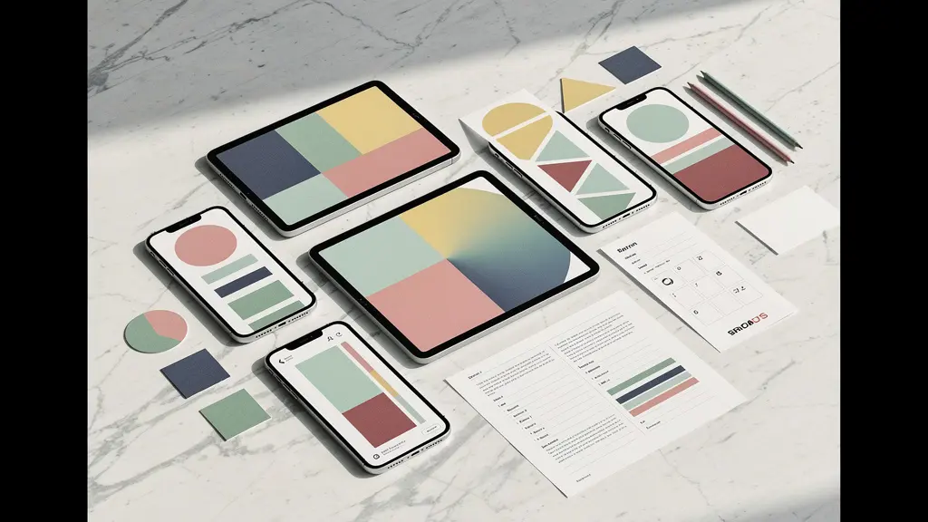
The greatest misconception in social media design is that consistency means “copy and paste.” A truly effective visual strategy doesn’t rely on a single, rigid master template. Instead, it’s built on a modular design system, or what we can call your brand’s Visual DNA. This system is not one master file, but a collection of core, non-negotiable brand elements—a primary and secondary color palette, a specific typographic hierarchy, a signature graphic motif, or a compositional rule—that can be flexibly reconfigured for any context.
Think of it like a set of high-end LEGO bricks. You have unique shapes and colors that are distinctly yours, but you can assemble them into a skyscraper for LinkedIn (structured, professional), a race car for TikTok (dynamic, fast), or a sculpture for Instagram (aesthetic, curated). The visual below illustrates this concept of aesthetic adaptation, where core brand components morph to fit different containers without losing their essential character. This is the key to being recognizable everywhere without looking repetitive.

To build this system, you must first define your visual constants and variables. Your constants might be your primary brand color and your logomark. Your variables could be the background texture, the layout, or the supporting graphic elements. For a Reels cover, you might use your brand color as a full-bleed background with bold, centered text. For a LinkedIn carousel, you’d use the same color as a subtle accent in a clean, grid-based layout. The brand is instantly recognizable in both, but the execution is native to the platform’s user experience. This approach provides the creative freedom to stay relevant while ensuring the brand’s core identity remains the unbreakable thread connecting every touchpoint.
Native Aesthetics or Brand Guidelines: Which Performs Better on TikTok Organic Reach?
The tension between brand consistency and platform-native content is most palpable on TikTok. A perfectly polished, corporate-branded video often falls flat, while a low-fi, trend-driven clip can go viral. The answer isn’t to abandon your brand guidelines, but to adopt an 80/20 approach. This means that 80% of your content should embrace the platform’s vernacular, while 20% is reserved for subtle, yet powerful, brand markers. This hybrid strategy allows you to participate authentically in the platform’s culture without becoming visually anonymous.
A brilliant example of this is Ryanair’s TikTok strategy. Their content is pure platform vernacular: jumping on trends, using trending audio, and employing a jokey, self-deprecating tone. The brand guidelines are not visible in the form of a persistent logo or corporate colors. Instead, the consistency comes from the brand’s unique voice and recurring character (the googly-eyed plane). They lean 100% into the native aesthetic, and their “brand” is the consistent personality. This proves that brand identity can coexist with native content, driving massive engagement and showing that native-feeling branded content drives significant consumer action.
For a more visual brand, the 20% can be executed through subtle but consistent “brand rituals.” This could be a consistent color grade applied to the final frames of a video, a unique text-on-screen style, or a recurring sound effect. The goal is to create recognizable patterns that don’t disrupt the native viewing experience. Here’s how to implement this 80/20 rule effectively:
- Allocate 80% to platform-native elements: Use trending audio, popular effects, and the platform’s built-in text styles to feel current and authentic.
- Reserve 20% for subtle brand markers: Introduce a consistent color grade, a unique transition, or a closing graphic that subtly reinforces your brand.
- Define ‘brand rituals’ instead of rigid rules: For ephemeral content like Stories or TikToks, focus on repeatable formats or cues rather than strict template adherence.
- Test and measure: Experiment with varying levels of branding, from zero to heavy, and track not just reach but also brand-building metrics like profile visits and save rates.
The Mistake of Letting Influencers Use Your Logo Without a Clear Style Guide
Collaborating with influencers is a powerful way to extend your brand’s reach, but it’s also one of the easiest ways to dilute your visual identity. The common mistake is to simply send a product and a PNG of your logo, hoping for the best. This often results in your logo being stretched, placed over a busy background, or used in a way that contradicts your brand’s positioning. Without clear direction, you are outsourcing your brand’s visual presentation to someone who doesn’t share your deep understanding of it.
A professional approach requires providing a streamlined, creator-friendly visual kit. This isn’t your 100-page internal brand bible; it’s a one-page guide that covers the absolute essentials for social media usage: logo clear space, primary color codes, and simple “do’s and don’ts.” The reality is that research reveals that 82% of successful organizations provide templates internally to ensure consistency; extending a simplified version of this to external partners is a logical and necessary step to protect your brand.
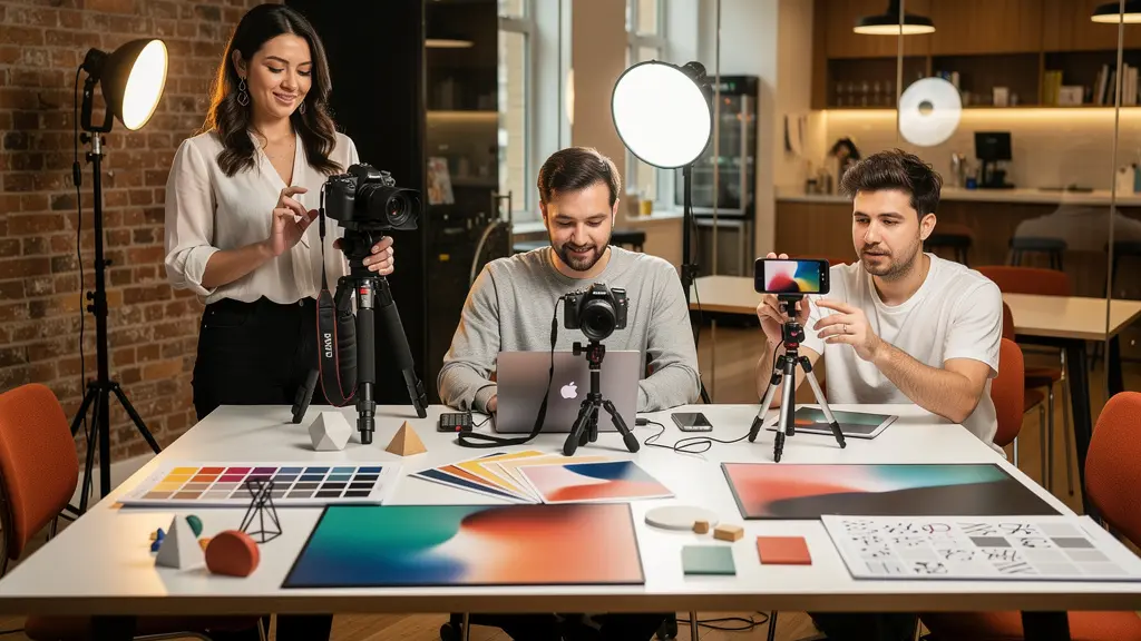
For more advanced partnerships, consider a tiered framework for creative freedom, as visualized above. A micro-influencer might be given more creative latitude, while a long-term brand ambassador helming a major campaign would have stricter guidelines to follow. This allows for both authentic, creator-led content and high-polish, brand-aligned messaging. The kit should include not just rules, but also assets: pre-made templates for Instagram Stories, approved font pairings, and a mini-library of lifestyle photos they can use. By making it easy for creators to do the right thing, you empower them to be better partners and transform them from hired megaphones into true extensions of your brand’s visual world.
When to Conduct a Visual Audit: The Quarterly Checkup to Ensure Your Profiles Match
Over time, even the most disciplined brands can suffer from “visual entropy”—a gradual, almost imperceptible drift from their core visual identity. This happens when multiple team members create content, new formats emerge, or old posts are left to linger. A profile picture gets updated on one platform but not another; a campaign-specific bio link is never changed back; Story highlight covers slowly become a mismatched collection. A quarterly visual audit is the essential checkup to combat this entropy and realign your digital presence. This isn’t about stifling creativity; it’s a strategic process to ensure every visual asset is working together to tell a cohesive story. The financial incentive is clear, as studies demonstrate that maintaining visual consistency can increase revenue by up to 23%.
The audit should be a systematic review of every visual touchpoint across all your social platforms. It’s a moment to zoom out and see your brand as a user does: a collection of grids, profiles, and feeds. Are they telling the same story? Does the mood of your Instagram grid align with the professionalism of your LinkedIn banner? This process ensures coherence and identifies opportunities for improvement.
Action Plan: Your Quarterly Visual Audit
- Profile & Banner Check: Verify that profile pictures are identical and high-resolution across all platforms. Ensure banner images are current and convey a consistent core message.
- Bio & Link Inventory: Standardize the brand description in all bios. Check all “link in bio” URLs to ensure they are correct, tracked, and lead to a consistent landing experience.
- Content Cohesion Analysis: Review Story highlight covers for design uniformity. Analyze the visual hierarchy of pinned posts and the overall mood of your content grids for stylistic drift.
- Asset Style Review: Examine video thumbnail styles, graphic template usage, and color palettes in recent posts. Do they align with your master Visual DNA or have they strayed?
- Competitive Benchmark: Briefly review the visual evolution of 2-3 key competitors. Are they adopting new visual trends that you should be aware of?
To quantify your findings, you can use a simple scoring system to rate the level of visual adherence for each platform. This helps prioritize what needs immediate fixing versus what can be scheduled for a later update. The goal of the quarterly audit is to turn maintenance into a proactive, strategic function, ensuring your brand’s first impression is always a strong and unified one.
The Design Mistake of Alternating Quote/Photo Too Rigidly That Makes Your Feed Look Dated
One of the most common—and dated—Instagram grid strategies is the rigid checkerboard pattern, typically alternating between a photograph and a text-based quote graphic. While it may seem like an easy way to achieve a structured look, this approach often feels robotic, sterile, and predictable. It signals to the user that the content is automated rather than curated, breaking the illusion of an authentic, evolving brand narrative. Modern grid planning has moved beyond such rigid formulas toward a more organic, yet still intentional, sense of visual rhythm.
Instead of a strict alternating pattern, sophisticated brands now think in terms of visual pacing and storytelling. A content calendar is crucial here, not as a rigid schedule, but as a tool to guide a natural flow. As experts note, a calendar helps arrange posts to flow organically rather than being scattered, allowing you to prepare for events while avoiding the automated feel of rigid patterns. The goal is to create a grid that feels dynamic and invites exploration, with a clear visual hierarchy that draws the eye to key “pillar” posts. This requires thinking about the grid in rows of three and planning mini-narratives that span across them.
To break free from the checkerboard and create a more dynamic grid, a visual content director should employ a variety of pacing techniques. The key is to create variety in texture, density, and color to keep the feed engaging. Here are several advanced techniques:
- Implement Row-Based Storytelling: Use a 3-post row to tell a single story, such as a product launch, an event recap, or a customer feature.
- Apply Color Theming: Subtly shift the dominant color of your grid every 6 to 9 posts to create visual “chapters” that feel fresh yet cohesive.
- Control Visual Breathing Room: Intentionally mix content densities. Follow a series of busy, detailed photos with a post that features significant negative space to give the viewer’s eye a place to rest.
- Mix Media Types Strategically: Create a rhythm by purposefully arranging different media types, such as high-production photos, casual behind-the-scenes videos, and clean graphic assets.
How to Protect Your Brand’s Visual Assets from Imitation and Dilution?
In an age of AI-generated content and fast-fashion branding, protecting your unique Visual DNA is more critical than ever. Your visual identity is a valuable asset, and its dilution through imitation or inconsistent use can erode the very foundation of your brand: trust. Indeed, research indicates that visual consistency serves as a powerful signal of reliability, which is why safeguarding your assets is a strategic imperative. Protection goes beyond legal watermarks; it’s about embedding your identity so deeply into your visuals that they become difficult to copy and instantly recognizable as yours.
The first line of defense is to develop “brand fingerprints”—subtle but distinctive visual motifs that are uniquely yours. This could be a specific type of compositional framing, a custom color grading signature that goes beyond standard filters, or a recognizable pattern in your motion graphics. These elements are harder for imitators to replicate than a simple logo or color palette because they are embedded in the creative execution itself. Documenting these unique treatments and building audience awareness of them creates a powerful moat; your community becomes the first to spot a knockoff because they are fluent in your visual language.
Beyond creative strategy, a proactive defense requires a multi-layered approach. Aesthetic watermarking, when done tastefully, can add a layer of ownership without compromising the image. But more importantly, a documented and registered visual identity provides a legal foundation should you need it. Here are several key strategies to defend your brand assets in the modern digital landscape:
- Embed Subtle Visual Motifs: Develop and consistently use unique “brand fingerprints,” such as a signature lighting style or a recurring graphic element, across all assets.
- Develop Unique Color Signatures: Create custom color grades and LUTs (Look-Up Tables) for your photo and video content that go beyond standard palettes and filters.
- Create Recognizable Composition Patterns: Establish a preference for certain compositional rules (e.g., a low-angle perspective, a specific use of negative space) that become associated with your brand.
- Document and Register: Keep a detailed, dated record of your visual identity system and consider trademarking truly distinctive visual elements.
- Build Audience as Defense: Cultivate a strong community that recognizes and values your unique aesthetic, making them your first line of defense against imitators.
Key Takeaways
- Visual consistency is not rigidity; it is the strategic adaptation of a core ‘Visual DNA’ to each social media platform.
- An 80/20 approach on platforms like TikTok—80% native aesthetic, 20% subtle brand markers—is key to balancing relevance and recognition.
- Regular quarterly visual audits are non-negotiable to combat ‘visual entropy’ and ensure a cohesive brand presence, which can directly impact revenue.
How to Balance High-Resolution Imagery with Platform Performance?
As a visual director, your goal is to present your brand in the best possible light, which often means using high-resolution, beautifully detailed imagery. However, every social media platform has its own aggressive compression algorithms that can degrade that quality, not to mention the impact on load speed and user experience. The challenge is to preserve as much visual fidelity as possible while playing within the technical constraints of each platform. This balancing act is crucial because the quality of your visuals directly impacts their effectiveness. If people remember visuals so well, those visuals must be clear, crisp, and compelling.
The key is not to upload the largest possible file and hope for the best, but to optimize your assets for each specific platform *before* you upload them. This means understanding the optimal dimensions, file formats, and quality settings for Instagram, LinkedIn, TikTok, and others. For example, a crisp PNG-24 might be perfect for a LinkedIn graphic where clarity is paramount, but a well-optimized JPEG at 85% quality is often better for a platform like Twitter, where speed is more critical. The metaphor of layered materials in the image below represents this process of optimization—some layers are crystal clear (high quality), while others are textured (compressed), but they work together to create a cohesive whole.

Each platform represents a different trade-off between quality and performance. On TikTok, motion and engagement matter far more than pixel-perfect resolution, so a 720p video is often sufficient. On Instagram, color accuracy is key to maintaining grid aesthetics, even if the file is compressed. Understanding these nuances allows you to make strategic decisions about where to prioritize quality. The following table breaks down the typical trade-offs you’ll encounter, helping you create a platform-specific optimization strategy that respects both your brand’s quality standards and the user’s experience.
| Platform | Native Format | Quality Trade-off | Brand Impact |
|---|---|---|---|
| 1080×1080 compressed | ~20% file size reduction | Maintained if color-accurate | |
| TikTok | 720p vertical video | ~30% quality reduction | Motion and trends matter more |
| 1200×627 PNG | ~5% quality reduction | Professional clarity crucial | |
| 1200×675 JPEG | ~25% quality reduction | Speed over pixel perfection |
To put these principles into practice, the next logical step is to conduct a full visual audit of your current social media presence using the checklist provided. This will give you a clear baseline and a prioritized action plan to build a more cohesive, powerful, and recognizable brand identity across every platform.