In summary:
- Raster images embedded in vector files are the primary cause of pixelation; all elements must be true vectors or correctly scaled, low-DPI rasters.
- Failing to convert text to outlines is a critical error, risking font substitution at the printer’s RIP and costing thousands in reprints.
- For brand-critical colors, Pantone Spot colors offer superior consistency over CMYK, despite a higher initial cost, by preventing color shifts (metamerism).
- Transparency effects must be properly flattened to a high-resolution raster/vector balance to prevent unintended white boxes or “stitching” artifacts in the final print.
- File delivery is a process, not just an export. A PDF/X standard coupled with a Technical Handover Sheet ensures full compatibility and eliminates guesswork.
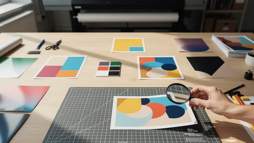
For a graphic designer, sending a file to print should be the final step. But for large-format printing like billboards, it’s the first step in a complex manufacturing process. A seemingly perfect design on screen can become a pixelated, discolored, and costly failure when printed ten meters wide. The common advice—outline your fonts, use CMYK, add bleed—is not wrong, it’s just dangerously incomplete. It treats file preparation as a checklist rather than what it truly is: an engineering discipline.
The discrepancy between a digital design and a physical billboard originates in a fundamental misunderstanding of how a printer’s Raster Image Processor (RIP) interprets data. These systems are not as forgiving as your design software. They follow strict rules where ambiguity in your file—from live fonts to complex transparencies—is resolved in ways that can ruin the output. The key isn’t to just follow the rules, but to understand the “why” behind them, anticipating and eliminating potential points of failure before they ever reach the production floor.
This guide moves beyond the surface-level checklist. It adopts the perspective of a prepress technician to deconstruct the most common and expensive large-format print errors. We will explore not just what you need to do, but why you need to do it, examining how file components interact with the physical realities of ink, vinyl, and finishing machinery. By learning to engineer your files for the manufacturing process, you can ensure that what you design is exactly what gets printed, every single time, without exception.
This article provides a detailed roadmap for creating technically sound, print-ready vector files for large-scale production. The following sections break down each critical stage, from handling raster elements and fonts to managing color, transparency, and final file delivery, ensuring your designs translate flawlessly from screen to billboard.
Summary: Mastering Large-Format Vector File Production
- Why embedding a raster image inside a vector file ruins the scalability?
- The font error that happens when you forget to outline text before sending to print
- Pantone Spot or CMYK Process: Which color mode ensures your brand red looks correct on vinyl?
- How to flatten transparency to prevent white boxes appearing on the final print?
- How much bleed does a 10-meter banner really need?
- Native files or PDF exports: Which format ensures safety when collaborating with agencies?
- How to adjust your 3D model angles so it can actually pop out of a steel mold?
- Is Switching from Adobe to Affinity Worth the Learning Curve for Freelancers?
Why embedding a raster image inside a vector file ruins the scalability?
The core principle of vector graphics is infinite scalability. A vector is a mathematical equation defining a path, which can be scaled to any size without losing quality. A raster image, conversely, is a finite grid of pixels. Embedding a raster image (like a JPEG or PNG) inside a vector file (like an AI or EPS) creates a fundamental conflict: the vector container scales perfectly, but the pixel-based image within it does not. When enlarged to billboard size, that embedded raster image will inevitably degrade into a blocky, pixelated mess.
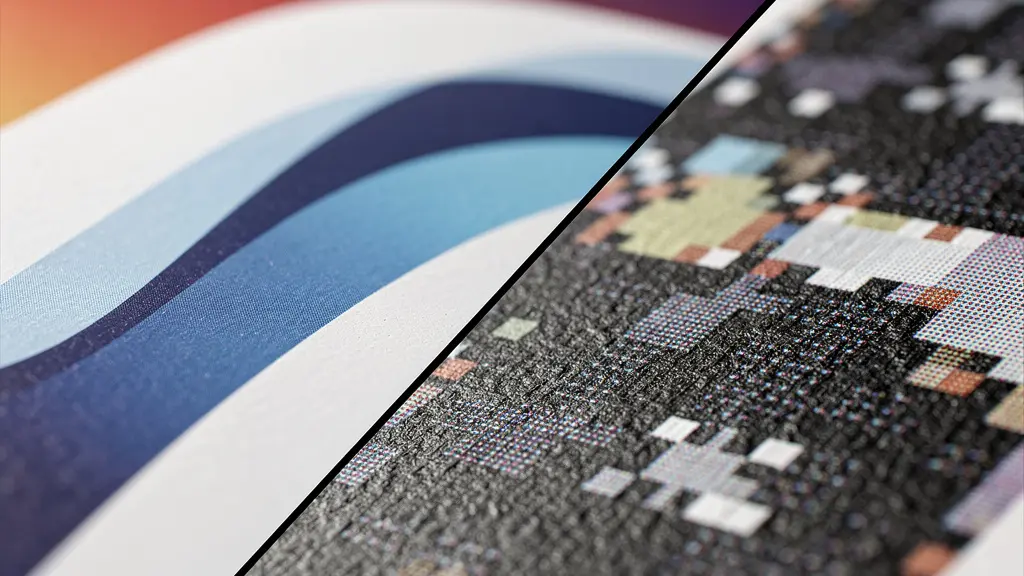
This issue is exacerbated by viewing distance. While a tiny logo might look acceptable on screen, its flaws become glaringly obvious on a highway. Industry standards dictate that text on a billboard must be legible from a minimum distance of 200 feet for highway traffic. For a raster image to hold up at this scale, it needs an appropriate resolution. However, “high resolution” for a billboard is counterintuitively low. Because of the vast viewing distance, the required dots-per-inch (DPI) is far less than for print media viewed up close. For a highway billboard, a final print resolution of 15 to 30 DPI is often sufficient. The key is to design at a 1:10 scale (e.g., a 10-meter billboard designed on a 1-meter artboard) and ensure any raster elements are set to 150-300 DPI *at that scale*, which translates correctly when enlarged.
Ultimately, the only truly safe elements for large-format printing are true vector shapes. If a raster image is unavoidable, it must be prepared with the final viewing distance and scale in mind, and the designer must confirm the required final DPI with the print provider. Relying on a small, low-resolution JPEG embedded in a vector file is the single most common cause of catastrophic quality failure in large-format printing.
The font error that happens when you forget to outline text before sending to print
Forgetting to convert text to outlines is perhaps the most frequent and easily avoidable prepress error. When you send a file with “live” text, you are sending the text itself plus a reference to the font used to display it (e.g., “Helvetica Neue Bold”). If the print shop’s computer does not have that exact font file installed, its system will automatically substitute it with a default font, like Arial or Myriad Pro. This substitution completely alters the design’s typography, spacing, and brand identity, resulting in a print that does not match the approved proof.
While this issue is a minor inconvenience in digital design, it becomes a financial disaster at billboard scale. According to print specialists, 99% of font-related print errors are simple to fix during the digital proofing stage. However, once the job is sent to the printer’s RIP and printed on hundreds of square meters of vinyl, the only solution is a complete, costly reprint. The process of “creating outlines” or “converting to curves” transforms the text from editable characters into fixed vector shapes. The printer’s system no longer needs the font file; it simply sees the letters as any other vector object, ensuring 100% fidelity to the original design.
A professional workflow is essential to prevent this. Designers should always maintain a master working file with live, editable text for future revisions. Only when the design is finalized and approved should a separate, print-ready version be created where all text is converted to outlines. This disciplined approach prevents accidental font substitution and protects both the designer’s vision and the client’s budget.
Action Plan: Professional Workflow for Text Handling
- Maintain a master version of your file with live, editable text, clearly named (e.g., ‘Project_WORKING.ai’).
- Once all copy is finalized and approved, save a new, separate version for the printer (e.g., ‘Project_PRINT.ai’).
- In the print version, select all text elements and use the ‘Type > Create Outlines’ command (or equivalent) to convert them into vector shapes.
- As a best practice, use your software’s ‘Package’ feature to collect all linked files and a copy of the fonts used, even if outlined, as a backup for the printer.
- Include a technical handover sheet with your file, explicitly stating that all text has been converted to outlines and listing the original font names for reference.
Pantone Spot or CMYK Process: Which color mode ensures your brand red looks correct on vinyl?
Color consistency is paramount for brand identity, but achieving it on a massive vinyl billboard is a technical challenge. The choice between CMYK Process and Pantone (PMS) Spot color is not a matter of preference but a strategic decision based on cost, consistency, and brand criticality. CMYK Process creates colors by mixing four inks—Cyan, Magenta, Yellow, and Key (Black)—in tiny dot patterns. This method is standard and cost-effective for full-color photographic images, but the final color can vary slightly between printers, substrates, and even print runs due to differences in ink, calibration, and RIP settings.
A Pantone Spot color, on the other hand, is a pre-mixed, solid ink formulated for a precise, globally consistent hue. When a brand’s red is “PANTONE 185 C,” using that specific spot ink guarantees that the red will be identical whether it’s printed on a business card in New York or a billboard in Tokyo. This method eliminates the variables of ink mixing on the press. However, it requires a separate printing plate and a dedicated ink run, making it more expensive. Another critical factor is metamerism, a phenomenon where colors appear to shift under different lighting conditions (e.g., daylight vs. fluorescent light). Pantone inks are highly resistant to metamerism, ensuring a brand color remains stable, whereas CMYK-mixed colors can show noticeable shifts.
The decision depends on the project’s needs. For a photographic billboard with a small logo, converting the logo’s spot color to a carefully calibrated CMYK value (like a rich black formula of C:60 M:40 Y:40 K:100) is often an acceptable compromise. But for luxury brands or campaigns where a specific color is the hero of the design, the extra cost of a Pantone spot color run is a necessary investment in brand integrity.
This comparative table, based on common large-format printing guidelines, breaks down the key differences to inform your decision.
| Aspect | CMYK Process | Pantone Spot |
|---|---|---|
| Color Consistency | Varies with profiles (GRACoL, FOGRA39) | Consistent across all prints |
| Cost | Standard printing cost | 15-30% premium for spot color run |
| Metamerism Resistance | Moderate – shifts under different lighting | High – stable under various light sources |
| Best Use Case | Full-color photographic billboards | Brand-critical colors, luxury brands |
| Rich Black Formula | 60C, 40M, 40Y, 100K recommended | Not applicable – uses solid ink |
How to flatten transparency to prevent white boxes appearing on the final print?
Transparency effects like drop shadows, glows, and opacity masks are powerful design tools, but they are a common source of errors in print production. These effects exist as “live” calculations within your design software. When a file containing live transparency is sent to a printer’s RIP, the processor must interpret these complex effects and “flatten” them into a simple, printable format. If the RIP is older or its settings are not perfectly aligned with how the file was created, this interpretation can fail, resulting in artifacts like unexpected white boxes (known as “stitching”), color shifts, or missing elements.
To prevent this, the designer must take control of the flattening process before exporting the file. The goal is to convert complex, layered transparency effects into a combination of simpler vector and raster objects that any RIP can understand. In software like Adobe Illustrator, the Flattener Preview panel is an essential diagnostic tool. It allows you to highlight objects affected by transparency and simulate how they will be broken down for printing. A key setting is the Raster/Vector Balance slider; for most billboard work, a setting around 75% preserves the sharpness of vector text and shapes while rasterizing complex gradients and shadows at a high enough resolution to appear seamless.
Special care must be taken when transparency interacts with spot colors. A drop shadow applied over a Pantone color, for example, can cause the RIP to misinterpret the color data. The safest practice is to convert any object with transparency that interacts with a spot color into its CMYK equivalent before flattening. An even more robust solution is to export the file using the PDF/X-1a standard, which forces the complete flattening of all transparency, creating a “what you see is what you get” file with maximum compatibility.
Case Study: Solving Gradient Banding
MAD Creative Concepts found that smooth digital gradients often produced visible “banding” or stepping when printed on massive billboards. The vast surface area makes subtle color transitions difficult to reproduce smoothly. Their technical solution is to add a small amount of monochromatic noise or grain (typically 1-2%) to their gradients before flattening. This technique, confirmed by various print preparation guides, breaks up the perfect mathematical transition with a subtle texture, tricking the eye into seeing a smoother blend and completely eliminating banding artifacts on their final vehicle wraps and large-format prints.
How much bleed does a 10-meter banner really need?
Bleed—the practice of extending artwork beyond the final trim line—is a fundamental concept in printing. However, the amount of bleed required for a 10-meter billboard is vastly different from the standard 3mm used for a business card. The required bleed for large-format printing is not a single value; it is dictated entirely by the physical finishing method that will be used after the banner is printed. A failure to provide adequate bleed for the specified finishing can result in unprinted white edges or critical information being trimmed off or folded into a hem.
For a simple trimmed banner, a bleed of 10-25mm might suffice. But for a banner that requires welded hems and grommets for hanging, the bleed requirement can jump to 50mm or even 100mm on each side. This extra material is physically folded over and welded to create a reinforced edge strong enough to hold a grommet under tension. Even more is needed for “pole pockets,” where a loop of material is created for a pole to slide through; this requires a bleed equal to the pocket’s diameter plus an extra margin for welding, often 150mm or more. For massive building wraps, the bleed is used for overlap between panels and can be 300mm or greater.
Equally important is the safety margin: the area inside the trim line where no critical text or logos should be placed. This margin must also scale with the finishing method to ensure important content isn’t punctured by a grommet or hidden in a pocket. As a rule, the safety margin should be at least equal to, if not greater than, the bleed. When designing, it is standard practice to work at a reduced scale, and professional guidelines recommend working at a 1:10 scale for billboards over 5 meters. This means a 100mm bleed on the final print would be represented as a 10mm bleed on your artboard. Before starting any design, you must obtain a technical specification sheet from the print provider that explicitly states the required bleed and safety margins for the chosen finishing method.
| Finishing Method | Bleed Required (per side) | Safety Margin (from trim) |
|---|---|---|
| Simple Trim | 10-25mm | 25mm |
| Welded Hems with Grommets | 50-100mm | 100mm |
| Pole Pockets | Pocket size + 25mm | 150mm |
| Building Wraps | 300mm+ (for overlap) | 500mm |
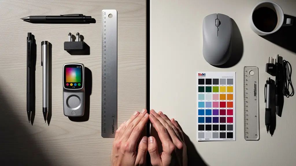
Native files or PDF exports: Which format ensures safety when collaborating with agencies?
The debate between sending native files (like .ai or .indd) versus a PDF export is a matter of control versus compatibility. Sending a native file gives the recipient full editability, which can be useful for collaboration but also carries significant risk. It allows for unintended changes, requires the recipient to have the exact same software version, and depends on them having all correct fonts and linked images. For final delivery to a printer or an external agency, sending a native file is generally a dangerous practice that relinquishes control.
A properly configured PDF (Portable Document Format) is the industry standard for final print delivery because it encapsulates all necessary components—vector data, outlined fonts, embedded images, and color information—into a single, self-contained, and more secure file. However, not all PDFs are created equal. The PDF/X family of standards was developed specifically for graphic arts exchange. The most relevant standards are:
- PDF/X-1a: This is the most restrictive and therefore the safest standard for compatibility. It requires all fonts to be embedded (or outlined), all images to be embedded, all color to be in CMYK or spot, and, most importantly, it flattens all transparency. This eliminates nearly all variables for the printer’s RIP.
- PDF/X-4: This is a more modern standard that allows for live transparency and color-managed workflows (including RGB elements with embedded profiles). It offers more flexibility but requires a modern, sophisticated RIP at the print shop to be processed correctly.
For billboard printing, PDF/X-1a is often the safest bet, but the final choice should always be confirmed with the print provider. True safety, however, extends beyond the file format. As Chris from Heighton Agency, a veteran of print design, emphasizes, clear communication is the ultimate safeguard.
True safety comes from communication, not just file format. A Technical Handover Sheet with software versions, color profiles, and special instructions prevents more errors than any file standard.
– Chris from Heighton Agency, 20+ years of print design experience
How to adjust your 3D model angles so it can actually pop out of a steel mold?
The principles of print-readiness extend into the third dimension, especially for creating 3D billboards or molded signage. A 3D model that looks perfect on screen may be physically impossible to manufacture. One of the most critical and overlooked specifications for molding is the draft angle. A draft angle is a slight taper applied to the vertical faces of a model, which is essential for allowing the finished part to be released from its mold without getting stuck or damaged.
For objects being cast in a steel mold, a minimum draft angle of 3 to 5 degrees is typically required. Without this taper, the friction between the object and the mold walls creates a vacuum effect, making release impossible without breaking the mold or the part. This principle must be considered at the very beginning of the design process. In software like Illustrator, when using Extrude & Bevel effects to simulate 3D, the perspective and bevel options must be configured to create these necessary angles, not just for aesthetics.
Case Study: From 2D Vector to 3D Manufacturability
In creating complex 3D signage, manufacturing specialists like Maa Illustrations have a strict workflow. They begin with clean 2D vector paths, ensuring no lines are thinner than 2mm and all sharp internal corners are slightly rounded to prevent weak points in the final molded product. Only then do they apply 3D effects, building in the necessary draft angles. This meticulous 2D preparation is crucial because flaws in the initial vector paths are magnified and become structural defects in the final 3D object, rendering it unmanufacturable.
The file handoff for 3D fabrication also requires specific formats. Instead of a PDF, manufacturers use formats like DXF (Drawing Exchange Format) or DWG, which are compatible with CNC (Computer Numerical Control) machines and CAD software. These files must contain clean, closed vector paths with simplified curves to reduce processing time for the machine. Including a scale reference object (e.g., a 100mm square) within the file is also a crucial step for the fabricator to verify the scale upon import. Preparing a 3D model for manufacturing is about translating visual design into a set of precise, physically viable instructions.
Key Takeaways
- A print-ready file is not a design checklist; it’s an engineered asset built for a specific manufacturing process.
- The most expensive errors (font, color, transparency) stem from a misunderstanding of how a printer’s RIP interprets file data.
- Communication with the print provider to obtain a technical specification sheet before design begins is the single most effective way to prevent errors.
Is Switching from Adobe to Affinity Worth the Learning Curve for Freelancers?
The dominance of Adobe Creative Cloud in the design industry is undeniable, with its software often considered the default for professional workflows. However, the rise of Affinity’s suite (Designer, Photo, and Publisher) presents a compelling alternative, particularly for freelancers and small agencies, due to its one-time purchase model versus Adobe’s monthly subscription. The question is whether the significant cost savings justify the learning curve and potential compatibility issues, especially in demanding fields like large-format printing.
For core vector design, Affinity Designer is a powerful tool with a feature set that rivals Adobe Illustrator. It handles complex vector operations, offers robust grid systems, and supports CMYK workflows and PDF/X exporting. However, the industry’s deep integration with Adobe creates friction. Many print shops, agencies, and clients have workflows built entirely around .ai and .indd files. While Affinity can open and export these formats, it’s not a native process, and subtle conversion errors can occur, particularly with complex effects or legacy files.
The learning curve is another factor. While many tools are analogous, the terminology, keyboard shortcuts, and workflow philosophy (like Affinity’s “Personas”) require a conscious effort to unlearn years of Adobe muscle memory. For a freelancer, time spent relearning is time not spent on billable work. The Blip Billboards Design Team offers a balanced perspective on this choice:
For small businesses testing billboard campaigns for the first time, the cost savings of Affinity might be worth it, but businesses running recurring outdoor campaigns need the reliability and industry-standard tools of Adobe.
– Blip Billboards Design Team, Billboard Design Best Practices Guide
Ultimately, the decision is strategic. For a freelancer just starting out or focusing on clients who value the final product over the process, Affinity offers a financially sustainable path to professional-grade tools. However, for those collaborating closely with large agencies or print houses with entrenched Adobe workflows, the time saved and errors avoided by staying within the industry-standard ecosystem may be worth the subscription cost. It’s a trade-off between long-term operational cost and short-term workflow friction.
Engineering your files for print is a non-negotiable skill for any serious graphic designer working with large-format media. By moving beyond a simple checklist and embracing a mindset of technical precision, you can eliminate costly errors, ensure brand consistency, and build a reputation for delivering flawless, professional results. The next logical step is to apply these principles by requesting and analyzing a technical specification sheet from a print provider before beginning your next project.